Description:
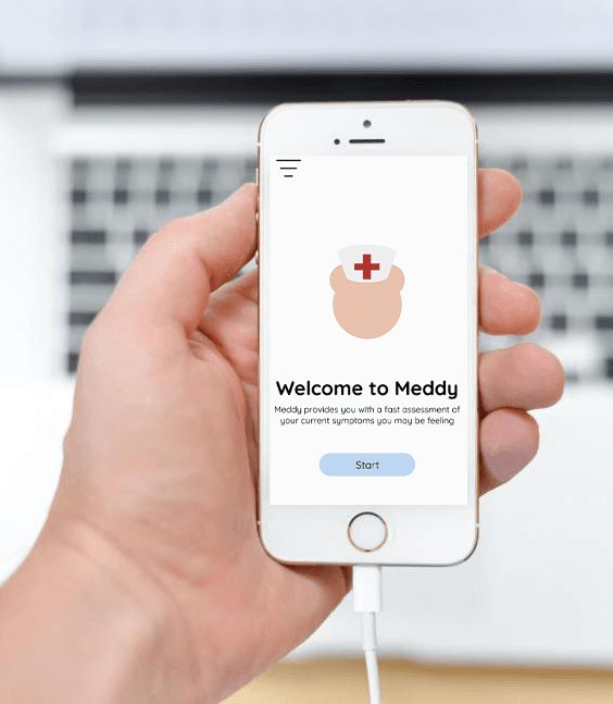
Meddy Provides feedback to users who answers questions on their symptoms and gives an generic vs branded medication to relive their symptoms.
My Role:
In the development process, I served as the product owner, lead developer, user experience researcher, data researcher, product designer, and presenter.
Project OverviewProblemOur team aimed to address the challenge where numerous users face common symptoms like headaches, dry eyes, and stomach aches but lack knowledge on how to alleviate their discomfort. In response, we developed an application to provide valuable suggestions and recommendations for effective symptom relief.GoalOur goal was to showcase a medical application that provides users with instant feedback through a clear and clean user interface, complemented by the inclusion of a friendly mascot. ChallengesFor an application offering medical suggestions, it is crucial to ensure that users comprehend it is not a prescription. Additionally, refrain from displaying advertisements or marketing content for brands like Tylenol and Advil.SolutionsIn crafting this application, our goal was to seamlessly offer users suggestions for their symptoms and recommend appropriate medications for relief. The implementation of a clear and clean user interface ensures an intuitive and straightforward experience, empowering users to effortlessly navigate and access crucial health information. To enhance the user experience, we introduced a friendly mascot, adding a touch of approachability and friendliness that fosters a positive and engaging interaction within the application. This intended user interface also creates a user-friendly and welcoming environment, catering to individuals seeking health-related information and assistance.
Tools & Duration:
Software Used: Github, Figma and Visual Studio Code, Adobe Illustrator
Design: Github, Figma and Visual Studio Code, Adobe Illustrator
Programming: Next Js, CSS, Json, Javascript
Duration:Duration: Feb - May 2023
Collaborators: 2
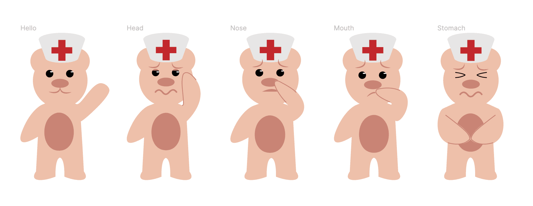
Design ProcessMascot InitialIn our team's initial brainstorming sessions, we contemplated incorporating a mascot to add a personal touch for users.Pros: Having a unique, creative mascot that aligns with the values of a healthcare provider offers several advantages.Cons: Without a fully developed visual, there's a higher risk of misinterpretation.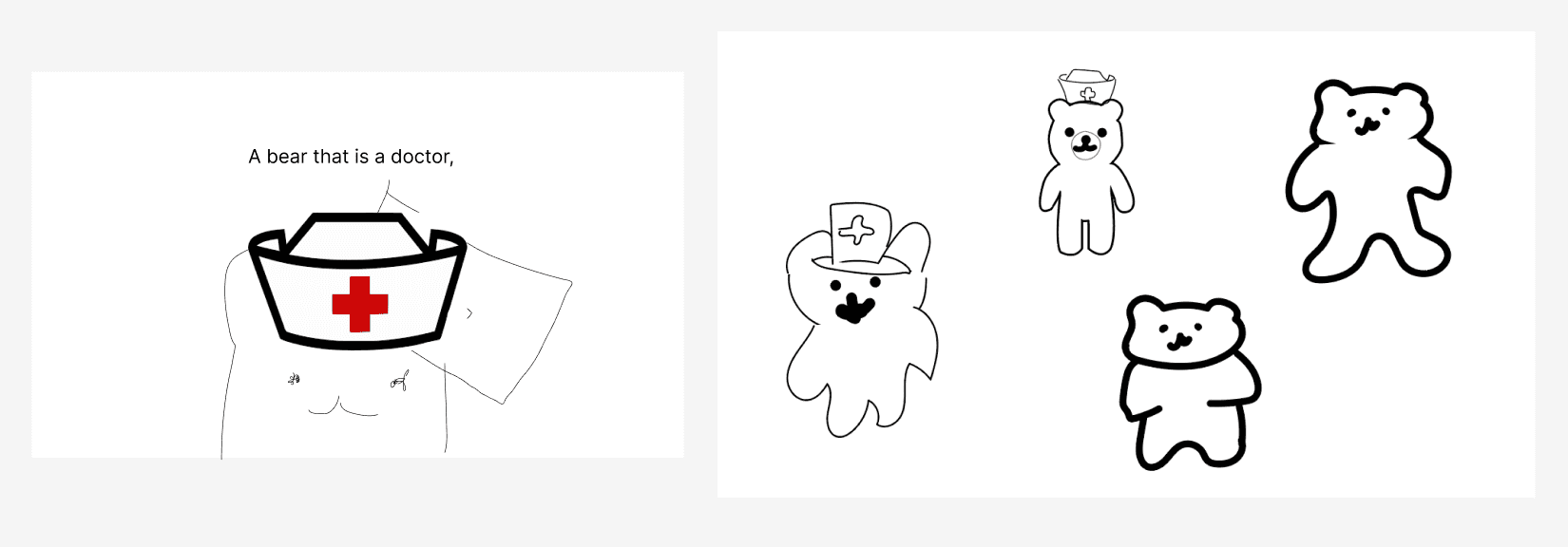 Mascot FinalIn our team's final mascot mockup, we incorporated a friendly, welcoming mascot to align with our app's goals
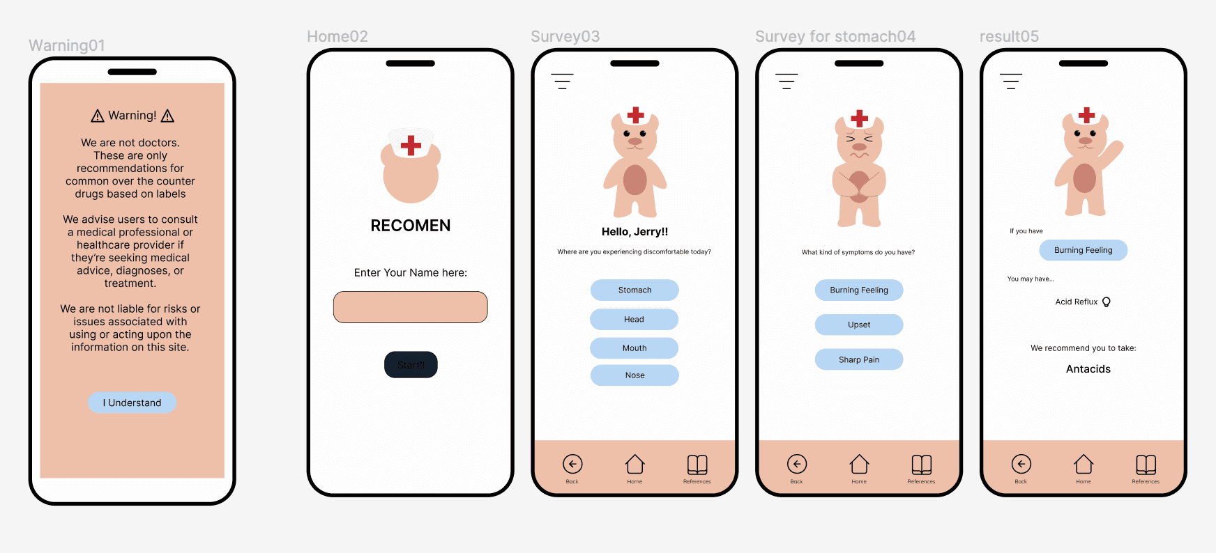
 Initial IdeasIn our team's initial ideas, we thought about getting straight to the point.Pros: Having the ability to navigate through two screens provides information about symptoms and medications.Cons: Navigating through two screens feels impersonal, and the information provided may not seem genuine or authentic.
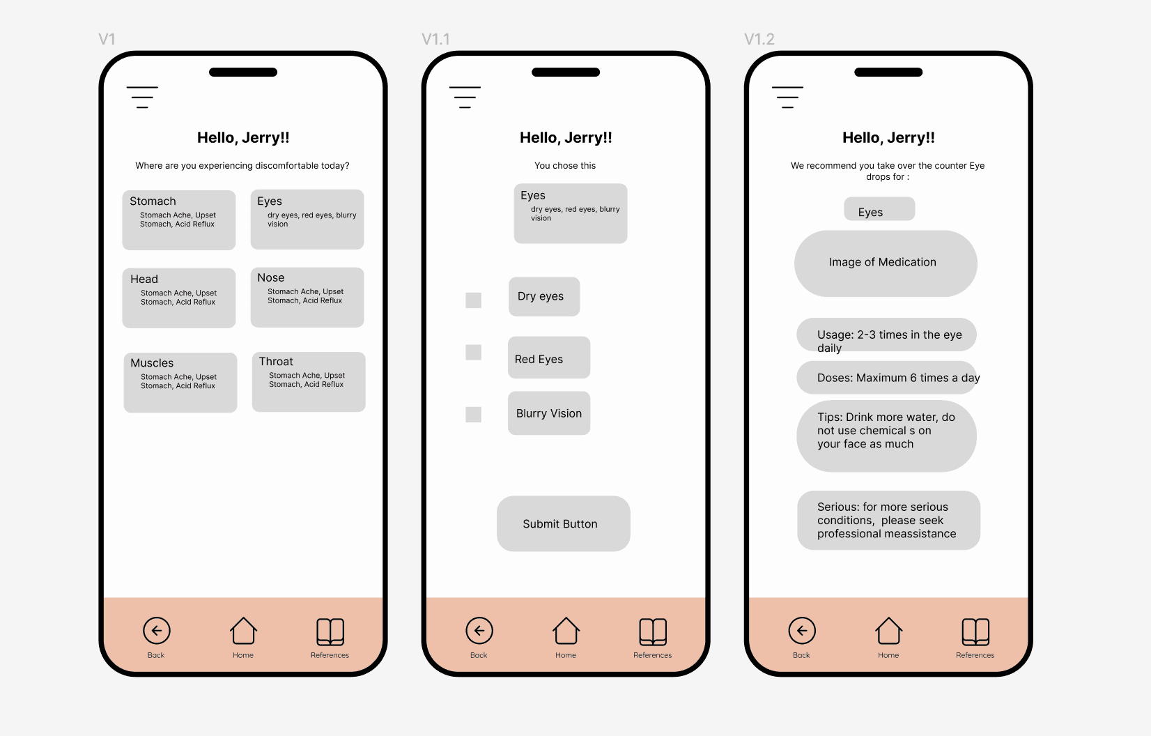
 Second IterationIn the second iteration, we considered providing users with the necessary information to inform them about potential conditions they might have.Pros: The user is introduced to additional information about their symptoms, enhancing their knowledge of potential symptoms.Cons: When there is an excessive amount of information on the pages, users may experience confusion or difficulty in finding relevant details.
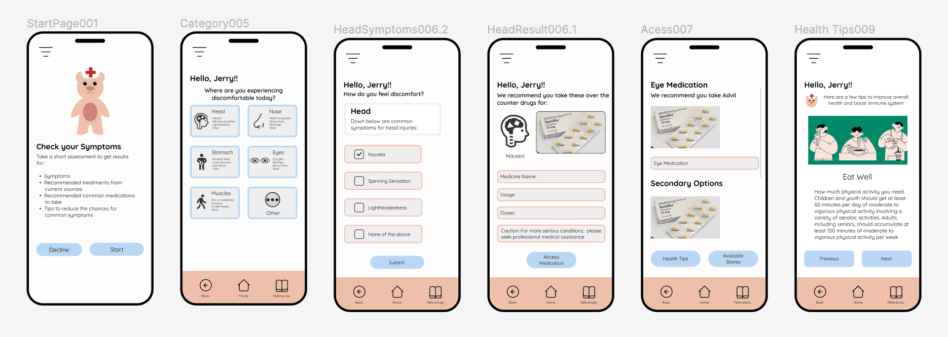
 Third IterationIn the third iteration, the team had to provide the medicine name, usage, doses, and a caution warning, along with references in case the user was unsure of the doses and usages provided.Pros: Users can refer to websites and links to find information about the suggested medicine.
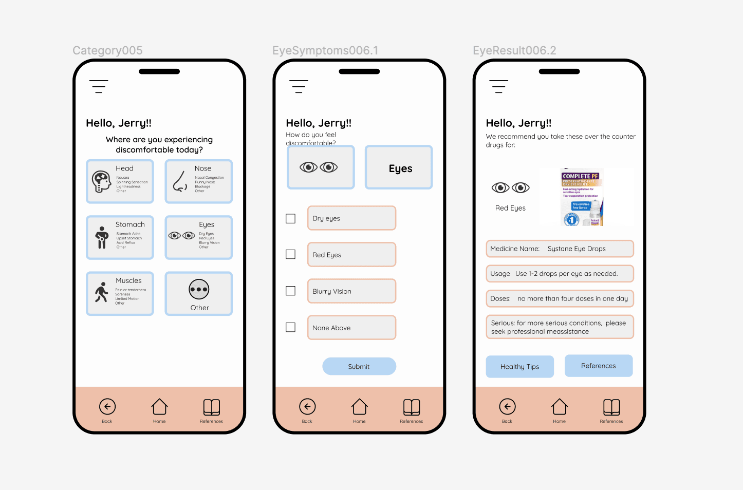 Final PrototypeOur team addressed the challenge of users lacking knowledge of symptom relief by developing this Hi-Fi prototype for the application. The final prototype includes user-friendly onboarding, an interactive symptom assessment, and a recommendation engine providing personalized suggestions for both generic and branded medications. Through multiple tests, the prototype ensures a seamless user experience, allowing for refinement before the actual development of the symptom relief application.
Style GuideOur team addressed the challenge of users lacking knowledge of symptom relief by developing this Hi-Fi prototype for the application.Color Theme: Soft colors create a calm and relaxing environment. This can be especially beneficial for meddy where users spend extended periods of time..Buttons: Large buttons are easier to tap on touchscreens, reducing the chances of users accidentally clicking the wrong option.Typography: Thin typography contributes to a clean and minimalist design. It allows for a more open and uncluttered appearance, which is effective in conveying a sense of simplicity and focus.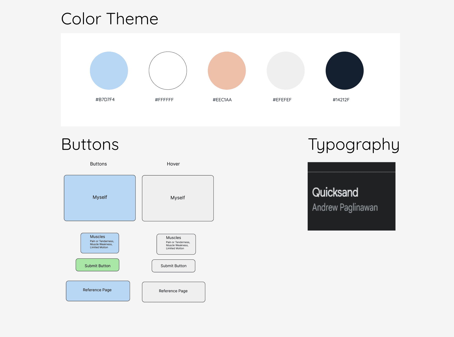


Usability TestingUsability ReportOur team conducted usability tests with classmates, gathered findings, and documented them in a Google Docs file.Methods: In person individual interviews.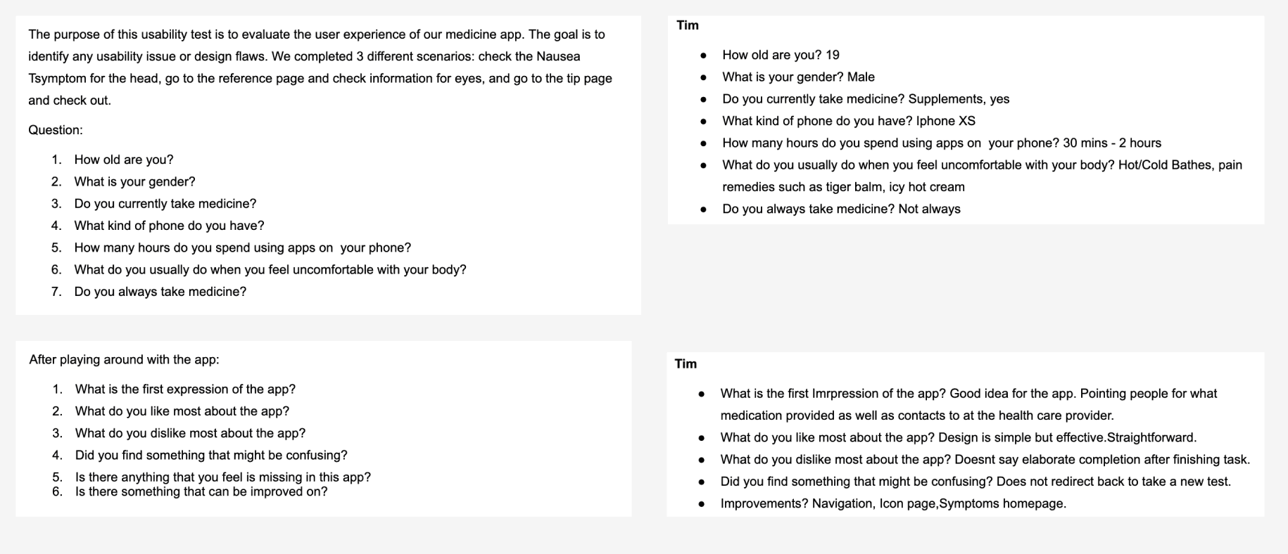

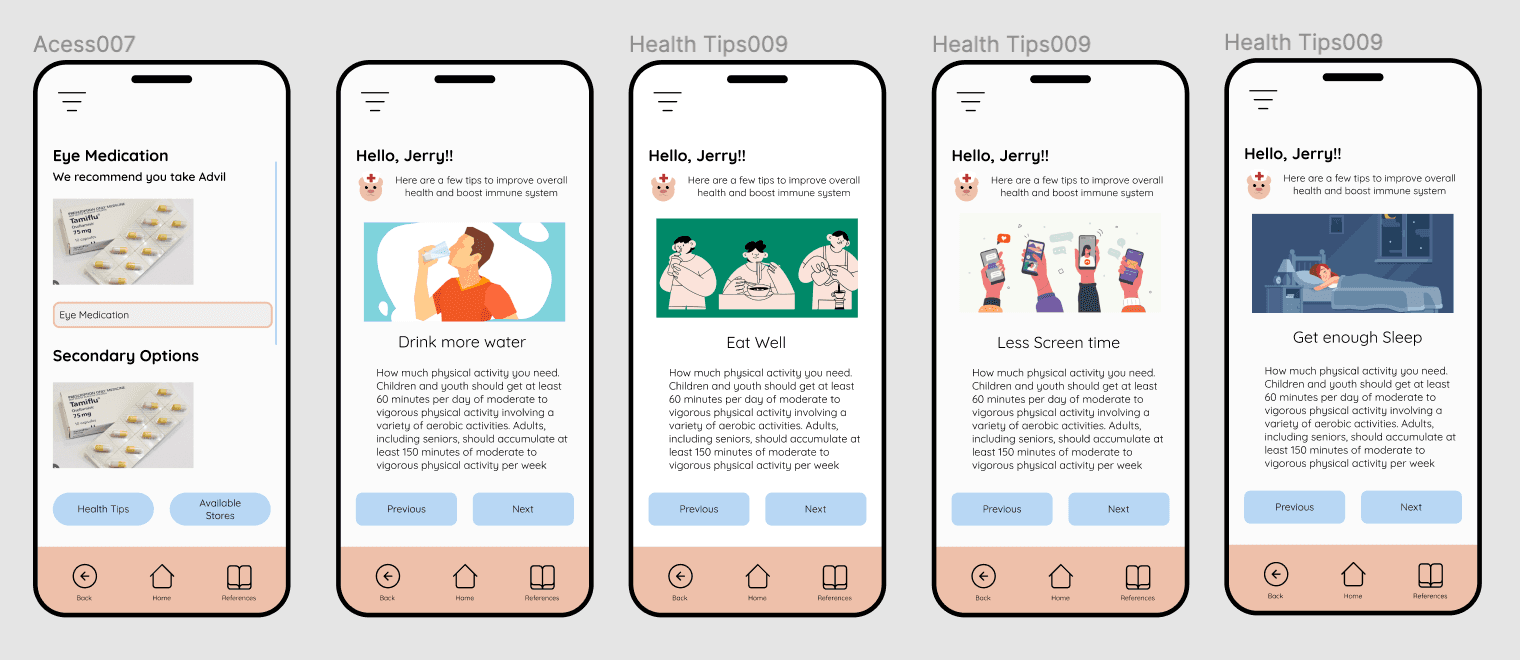
Report FindingsOur team adjusted a few technical functionalities and added a health section.Conclusion: The team added a 'Health Tips' section to provide additional information on maintaining a healthy lifestyle and well-being, accessible after obtaining your results.